Commercial fashion photo shoot for Mimi Florence Designs
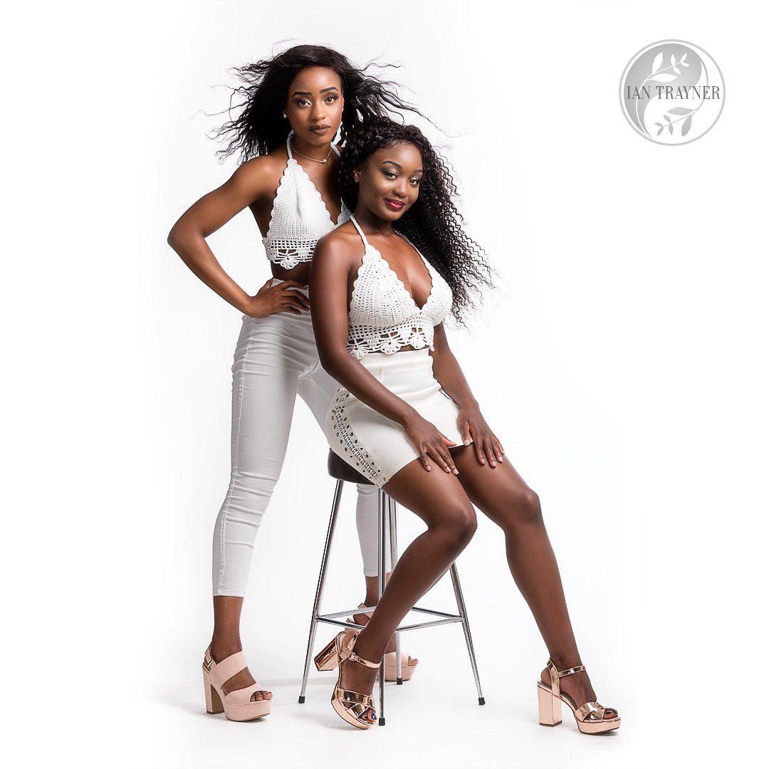
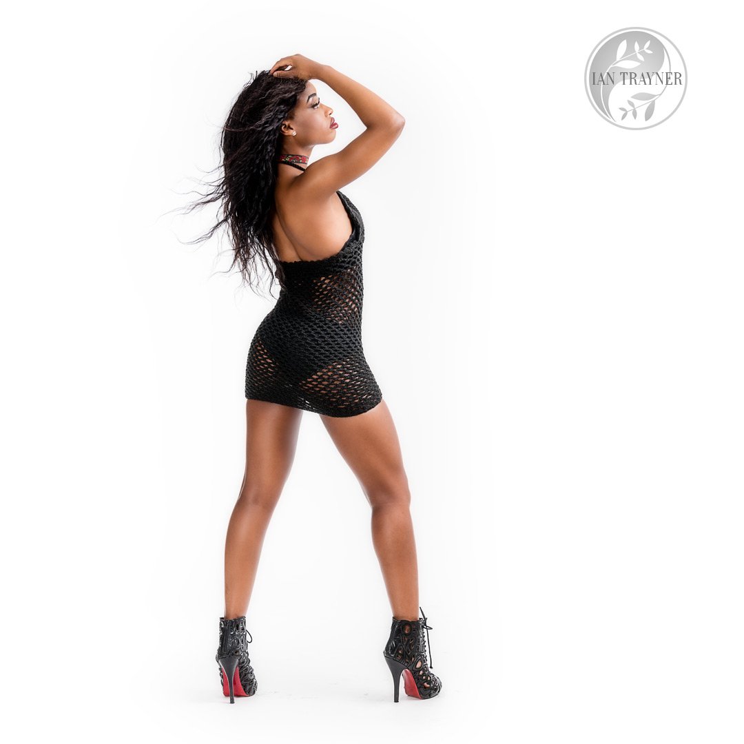
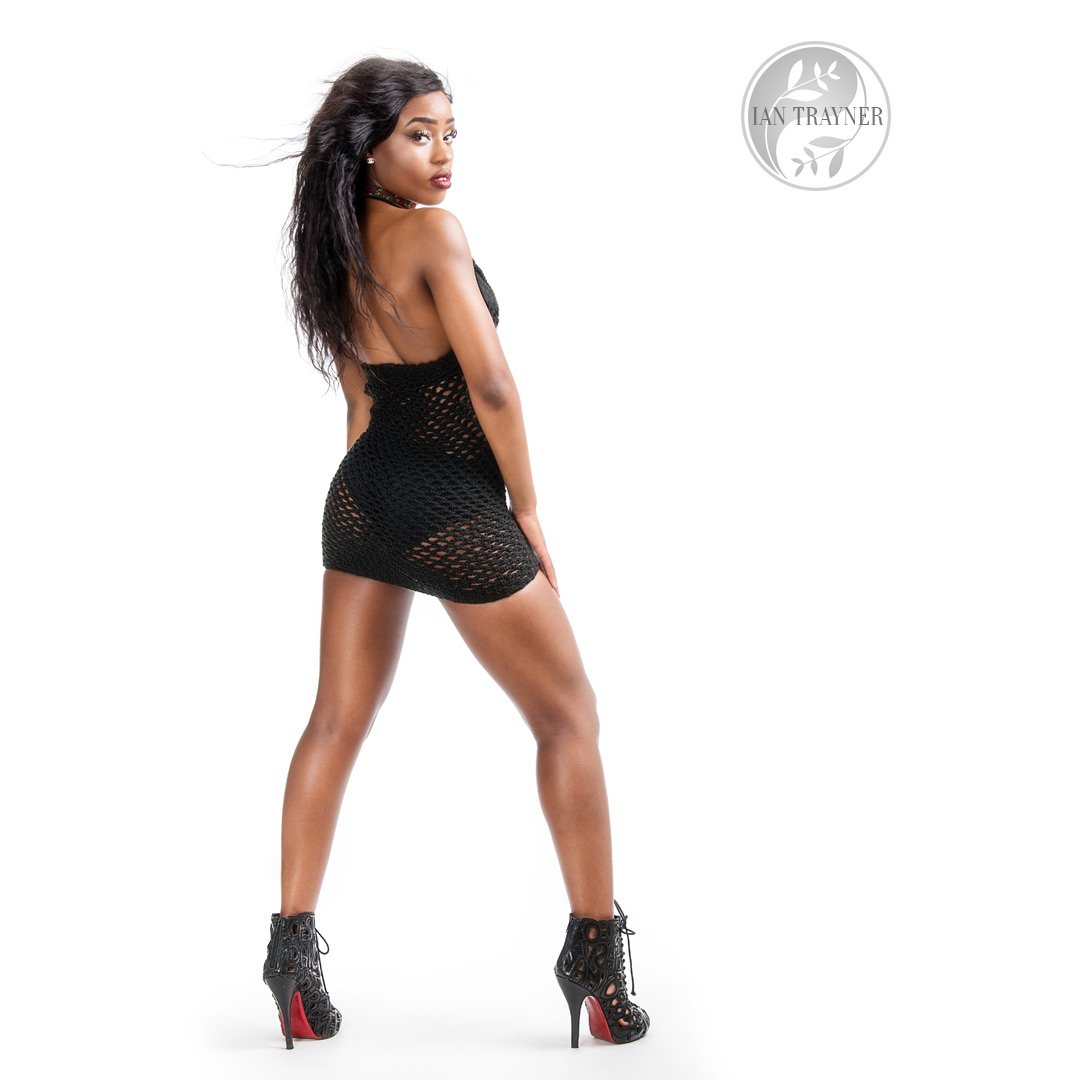
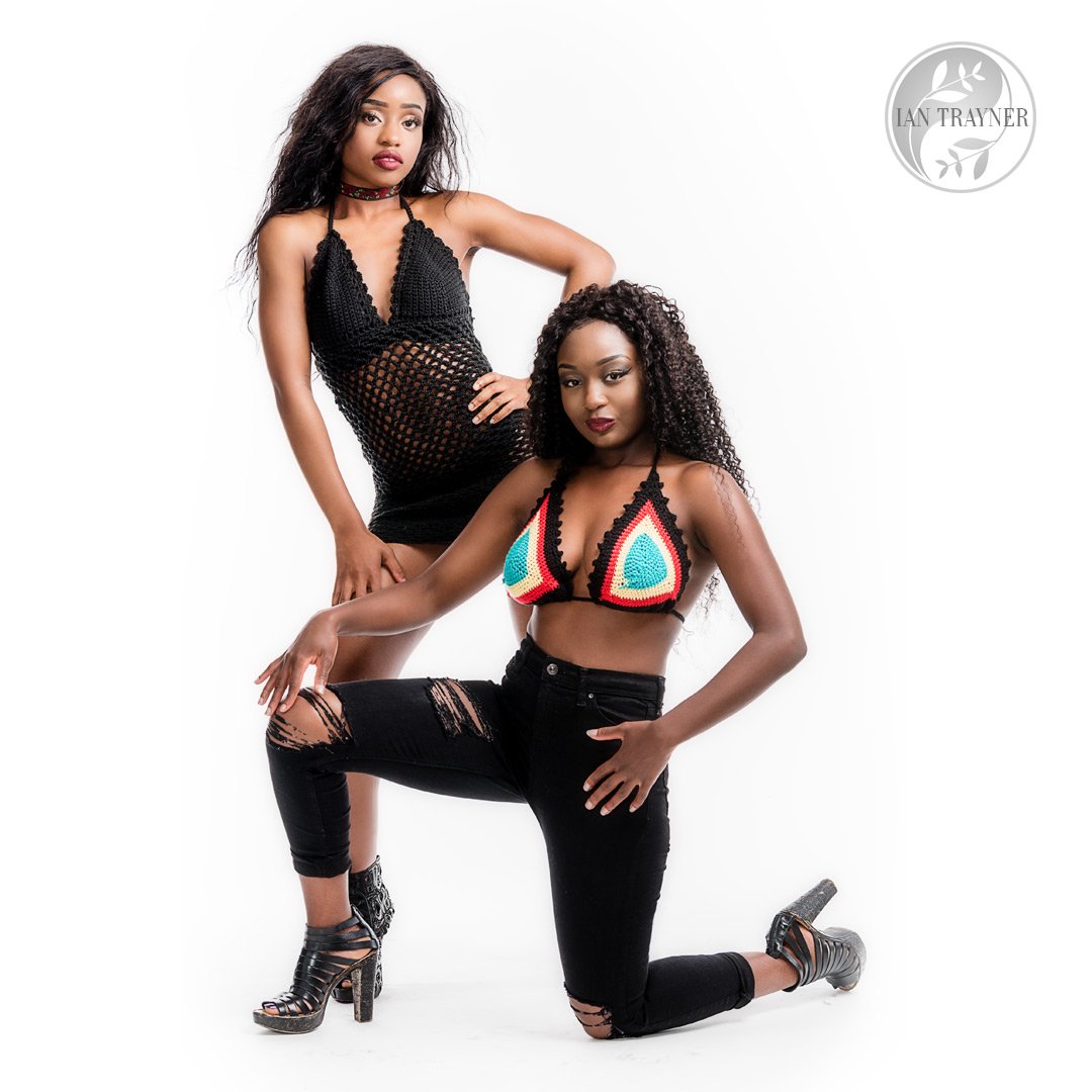
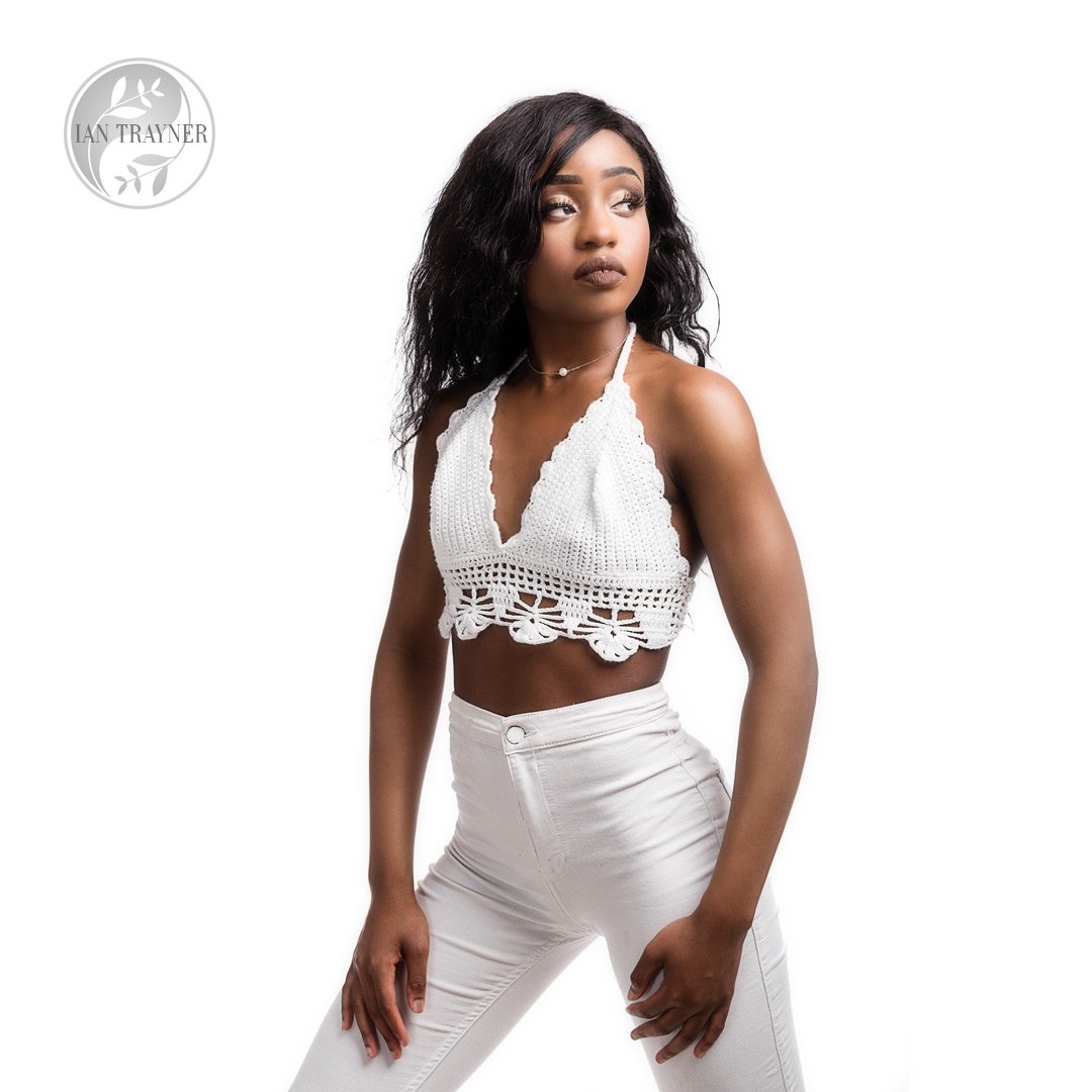
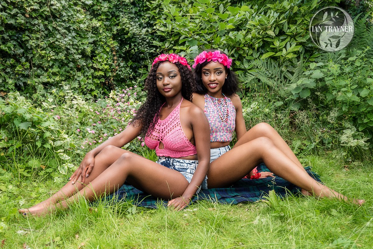
Mimi Florence Designs is run by a gifted mother of three beautiful kids. She loves to crochet and make jewellery. Each item is custom made for the client. We set up a commercial fashion photo shoot to provide high quality images for her.
Personally I would describe designs from Mimi Florence as “extremely flattering for ladies who have lots of self confidence”. I mean particularly women who feel good about their bodies.
But look at my images from the photo shoot, and judge for yourself.
Technical info about setting up this commercial fashion photo shoot
Shooting high key in the studio
For the high key shots I used pretty standard high key lighting. I used two flash heads for lighting the white background, one on each side. These were each fitted with a tall slim softboxes. For the key light I used a 1m deep octaganol softbox with grid. I angled the key light with care so that it gave (a) flattering directional light on the models and (b) a good spread of light on the ground at their feet.
Yollanda’s hair obliged me to move the key light to the “less convenient” side of my studio, that is to say the right hand side, looking at the model from the camera. This side is less convenient solely because of the shape of my studio, and there is less room for putting lights on the right than on the left. If I had not done this, I would have been struggling with a shadow on Yollanda’s face from her hair (because her hair has a parting on her left, which is the right as you look at her from the camera).
Shooting outdoors using natural light
When we went outdoors I used only natural light. The location is the garden at the back of my photo studio in Kingston upon Thames. If you look at the very last photo, Michelle’s eyes are looking more or less in the direction of the sun, which was already quite low in the sky. Michelle is the model with slightly wavy hair, who is wearing the pink top. The models were sitting in dappled shade under a tree. Because sometimes the sun threw displeasing bright patches of light on the models, I had an assistant (actually it was Venus, the make up artist) hold up a semi-translucent screen between the sun and the models.
Also, because I needed more light coming onto the models from camera left, I had another assistant hold up a large white reflective screen (by large, I mean something like 6 feet by 4 feet). This threw just the right amount of light back onto the models faces. This combination gave a very pleasing natural light effect. Unless you were an experienced photographer, you probably wouldn’t notice that the ambient light had been “modified”.
The creative team behind this photo shoot
Photographer: Ian Trayner
Models: Yollanda Musa and Michelle Chaxs
Make up: Venus (search instagram for @_makeupby_vee_)
Designer: Mimi Florence Designs
